Things I’ve seen: Easy websites that changes that can make a massive difference
Over the past decade I must have looked at thousands of brand websites. The way a website looks, feels and performs can be the difference between the press featuring your product over someone else’s or that customer placing the order with you over your competitors.
According to Sweor.com It takes about 50 milliseconds (that’s 0.05 seconds) for users to form an opinion about your website that determines whether they like your site or not, whether they’ll stay or leave. They also say that 57% of internet users say they won’t recommend a business with a poorly designed website on mobile.
Saying this, we all know that for small businesses time and money is short so if you are to make website changes, where do you focus your budget. Looking at this will my PR hat on I’m going to run through my top 7 websites changes that will not only make a difference to your customers but also to the way press view your brand.
1. KEEP IT SIMPLE AND LET YOUR LIFESTYLE IMAGERY
DO THE TALKING
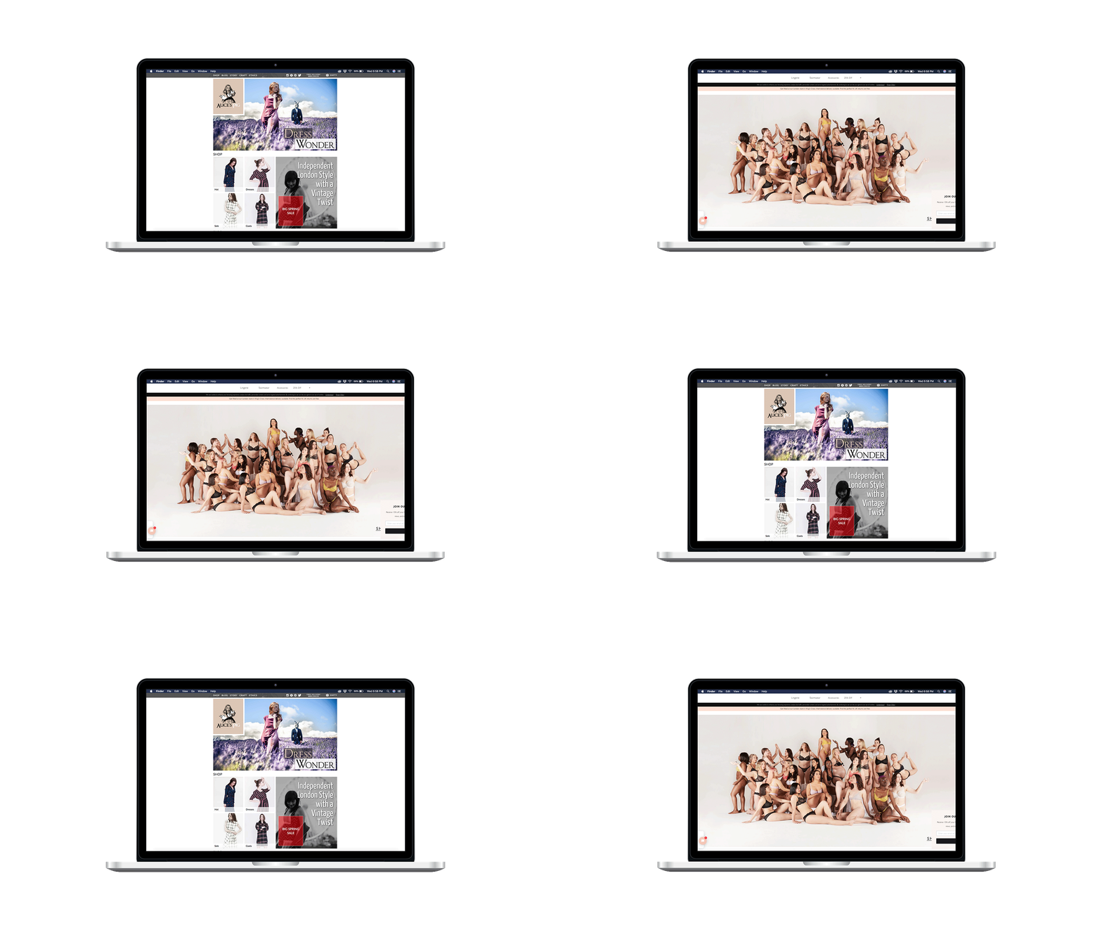
Anyone who has taken part in our PR Power hour will know that imagery is key for PR. It’s also crucial for that all important first website impression. Look at the two websites below… Which one do you think people will be engaged with?
1. Beija London
OR
2. Alice's Pig
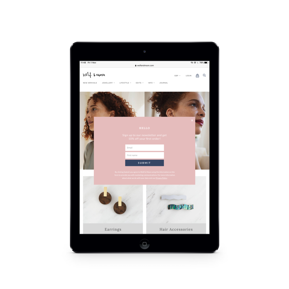
2. NEWSLETTER SIGN-UP WITH 10% OFF YOUR FIRST PURCHASE
From years of experience, if someone sees your products in the press the likely hood that they will buy there and then is next to none. Remember that PR is about awareness and capturing customers. You want to keep them engaged with your brand and the best way to do this is through email marketing. A small discount of their first purchase will usually entice them to do this.
3. YOUR WHY… AKA YOUR ABOUT PAGE
As a small business your ‘why’ is what might sway a potential customer to a purchasing customer. Who are you are (or who is your brand), how are your products made, what is important to you… But be careful not to bore your customer. One of the best About pages I’ve ever read are from PJ brand Desmond and Dempsey. It tells me everything I need to know about the brand, founders, products without being an “And then I did this” timeline.
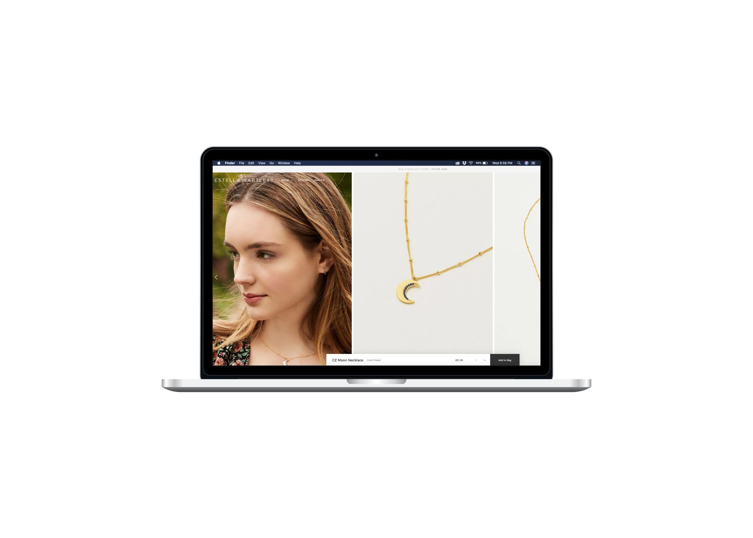
4. HAVE YOUR PRODUCT CUT-OUTS ON YOUR PRODUCT LISTINGS
Don’t panic. It doesn’t need to be the main product photo but it is important that as you scroll through images your product cut-out shots are there.. mainly for the press to steal and use in their features. Good examples of these are Estella Bartlett and Freight.
5. HOOK UP YOUR GOOGLE ANALYTICS
Firstly, you might have had press and not even know as a lot of the time the press will steal images from your website and feature you without emailing you back (see point 6). Google Analytics is also key to measuring what is working. For example, you might be featured in Stylist and not sell a single one of the products featured – you think “that press hasn’t worked” but your analytics tell a very different story – The coverage has sent through 600 people and £150 of sales in other products… You can only get this information from your Google Analytics. Make sure it is hooked up to not only your website but also your ecomm shop.
6. SOCIAL MEDIA HANDLES IN TOP RIGHT OR FOOTER
I think I speak for everyone when I say it’s frustrating when you are on a brand’s website and you love their products, story aesthetic and the next natural steps are to follow their Instagram… but you can’t find their Instagram handle. Even if you have your feed pulled through on to your homepage you should always have your social media handles on every pages of your website. A Weathered Penny are a great example of using social links on all pages.
7. USE YOUR PRESS TO SELL YOUR PRODUCT
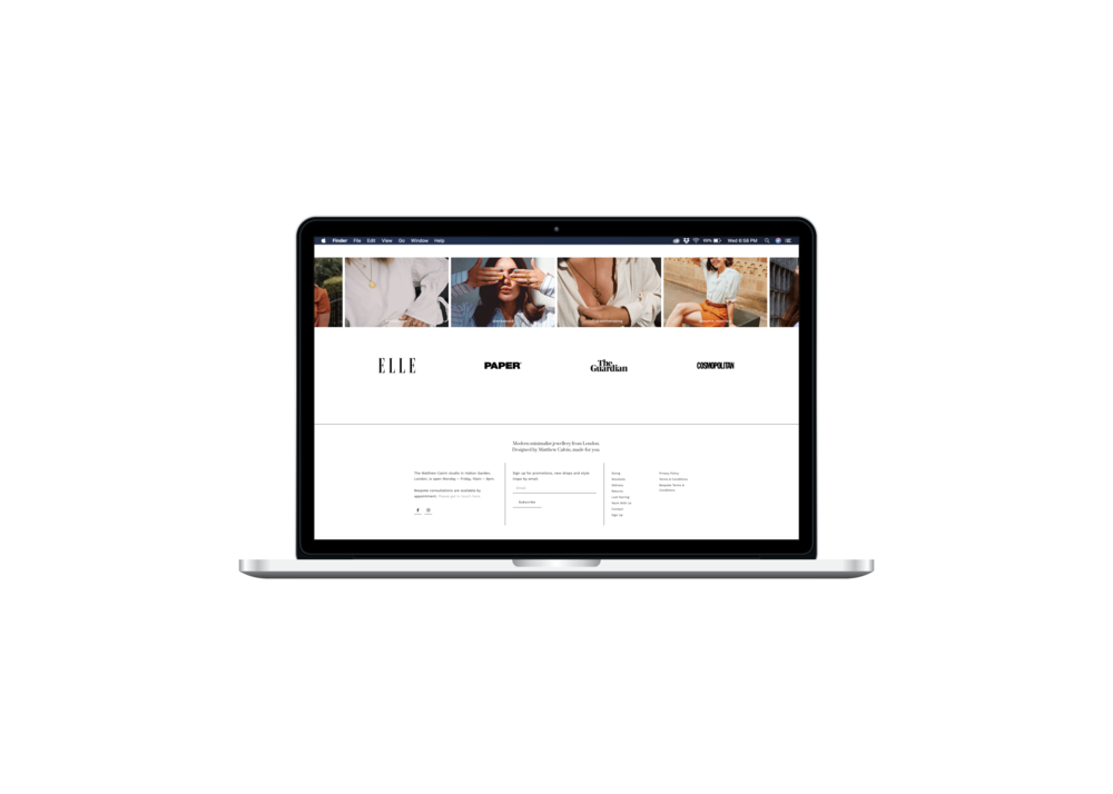
As seen in, as featured by… that little logo or few words next to a product can make a world of difference when a person has just discovered you and is looking for that piece of reassurance.
The 7 changes above should be easily made without a developer and with very little budget (unless you need to redo imagery). If you have any questions on the above, please ping them over to us on our Instagram. I’m going to leave you with this very useful video from Elizabeth Stiles on ‘Why your customers aren’t clicking the buy button’… Well worth a watch.
Rosie x
I’ve worked with brands day in day out for over 10 years. I’ve seen the good, the bad and everything in-between. I was given the task of doing PR for an independent brand with no previous experience and within a few months was gaining coverage – I know that any independent brand with the right advice, resources and support can do the same without spending thousands on an agency which is why I created PR Dispatch. You can find out more about our memberships here.


