5 things every ecommerce website needs on their product pages
Product pages are arguably the most important part of an ecommerce website. It is the place where your browsers will make the decision to buy or not and then they become your customers.
But often we spend so long working on our overall website design and primarily the homepage that the product pages become an afterthought.
Creating the perfect product pages for your website requires attention to detail and a focus primarily on your customer needs.
Try starting off by thinking that you’re selling in a bricks-and-mortar shop and a customer walks in. They are interested in a product you sell, and they want to know everything about it.
What would you tell them?
What would you show them?
How would the product make them feel?
This is exactly what your product pages need to include.
But to keep things simple, here are 5 things you should absolutely include on your product pages:
IMAGES
The first thing that your customers will probably notice on your product page is your images.
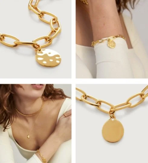
It is therefore essential to have high-quality product images that showcase your product in the best possible way. Ideally these would be professionally shot and I highly recommend investing in this as early as you possibly can when starting your business, probably something you have already learned the importance of if you are working on your PR.
As well as this, you need to make sure you are showing customers more than one image. So have as many images of your product as you can, including close-ups of features (if you sell ceramics), inside (if you sell notebooks), from different angles (if you sell shoes) and on a model (if you sell clothing).
In terms of your website design, it’s so important to make the images as easy as possible to view, meaning you need to clearly show there's more to scroll through with thumbnails and arrows on your product page.
@monicavinader
2. USER-GENERATED CONTENT
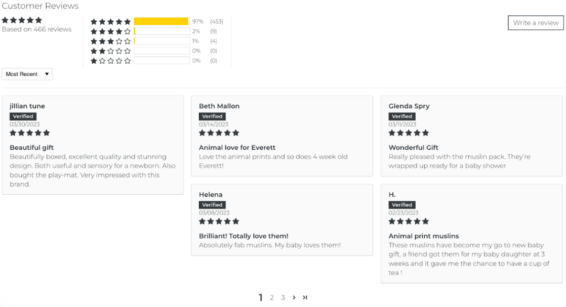
UGC, or user-generated content, is an essential part of any small business website. It helps build trust and allows potential customers to learn more about your products from current customers.
Although there are many areas of your website you’ll want to include customer reviews, the most important place has to be your product page.
As consumers, we want to know what we are buying and who we are buying from is trustworthy, the easiest way to feel sure before purchasing is by scrolling down and reading the reviews.
Make sure to display customer reviews and ratings prominently on your product page, this means including your star rating and review total near to the product title and price as well as your review app widget (the place where all your customer reviews are shown) further down your product page.
In addition to reviews, using customer imagery either within your product images or on other content blocks on your product page can show your customers what your products are like ‘in real life’ and can help towards building that trust.
Although I’ve highlighted the importance of professionally shot images, real life imagery from customers is just as useful on your product pages and can help build your brand community.
@ettaloves
3. PRODUCT DESCRIPTION
Your product description is where you can provide more information about your product, such as its features and benefits. A detailed product description will help customers understand what they are buying and why it is worth their money.
You should create interesting, informative and unique copy for each product you have and don’t forget to use your product description to actually sell your product!
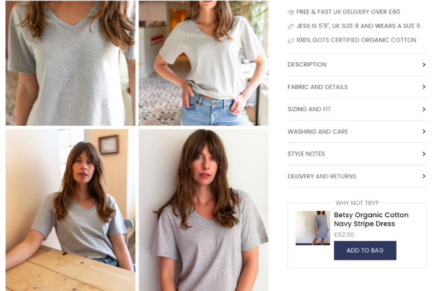
The extra information you have, such as features and specifications should be placed within tabs or accordions. This helps break down longer pieces of copy into short easy-to-read chunks and lets your customers find the information they need to get them to purchase.
@ivy
4. BENEFITS
Something that’s often forgotten about on product pages is highlighting your brand USPs and it's vitally important to show these on your product pages as well as your homepage.
If you sell something in a crowded market, like children's clothing, customers want to know why they should buy from you, what makes you different as a brand and what you offer that others don’t.
It’s also the perfect place to tell customers why they should shop with you.
This means featuring thighs like your free shipping offer, other promotions and your returns policy, making sure to highlight them prominently and clearly.
Customers want to know exactly what they are paying for and what they can expect to receive, so if you go above-and-beyond with your customer service, let them know this.
@thoughtclothing
5. RELATED PRODUCTS
As brand owners it’s easy to think everybody knows as much about your products as you do. But they don’t. And often, when you browse a website and perhaps arrive straight onto a product page, it’s not immediately clear all the other brilliant products you sell.
So make sure you are showing related products to encourage customers to add more items to their basket.
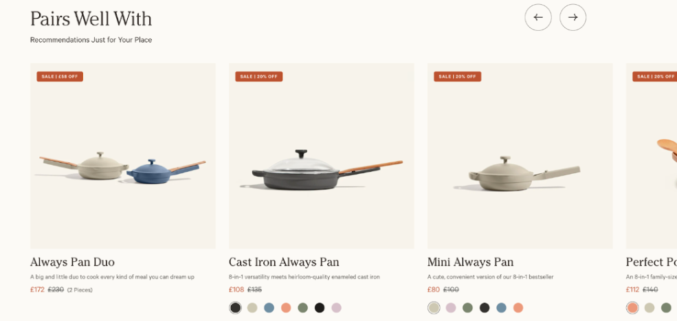
You can use both upselling (think add-ons and buy it with) and cross-selling (you may also like, pairs well with) techniques on your product pages.
By suggesting complementary products or accessories or showing bundle deals, you’re not only encouraging customers to spend more but actually being helpful and showing them more of what they might like.
@ourplace
Elle Williamson (The Ecommerce Assistant) shows independent businesses how to get the most out of their online shop and to maximise their ecommerce sales. You can find Elle online at theecommerceassistant.com and @theecommerceassistant


